Acknowledging the Z in the room
Almost exactly a year ago, Russia began an invasion of Ukraine leading to tens of thousands of lives being lost and causing the largest refugee crisis to hit Europe since World War 2. Countless families have been impacted by this unwarranted act of aggression.
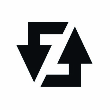
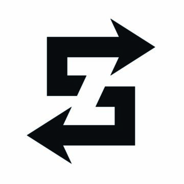
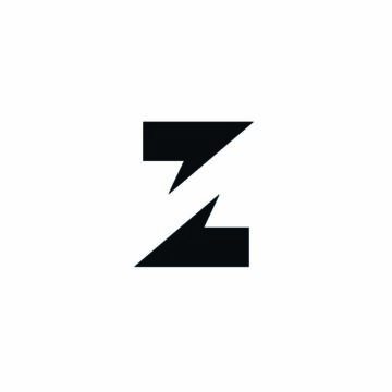
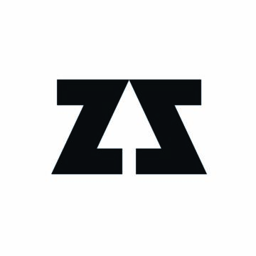
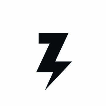
As the war developed, the letter Z became increasingly used as a symbol of support. A letter which for the best part of a decade has represented our services. Although we did identify this at the time we chose inaction hoping that allowing the Z to exist in different contexts would free this letter from being taken hostage by hatred. Besides we didn’t want to create a meaningless gesture which could have come across as shallow.
As the war progressed it became apparent to us that this approach was increasingly naïve. Larger brands were modifying their logos and countries were beginning to take action on the Z as a symbol of hatred. Inaction was no longer a positive statement, instead, it was beginning to make us complicit. Our values are so far removed from this act of aggression we began to look for a meaningful replacement.
Rebranding
For some a rebrand is easy, approach an agency and let them deal with it.
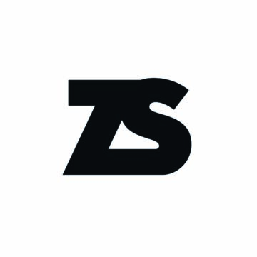
For us, it was an internal labour of love which took 6 months and led to companywide conversations about our values. Many ideas were discussed and many failed. Some didn’t translate well, others were too complex, and one could be portrayed as equally hateful symbol to the Z.
I thought there was some value in sharing them below to give you an insight into the journey we took (and the mistakes we made).
Focusing
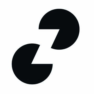
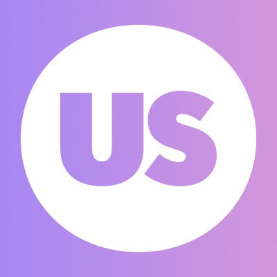
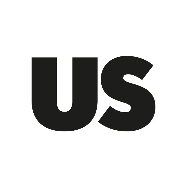
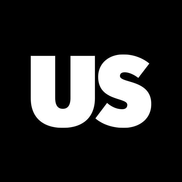
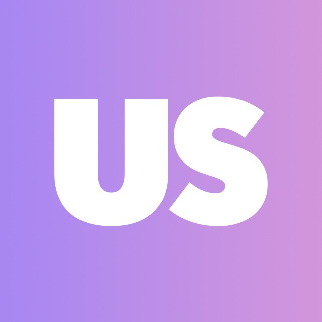
Zealous has always been about bringing people together, accepting our differences and creating a sense of belonging. This is something that permeates through our product (allowing organisations to work with a diversity of people through open calls), but also across our community initiatives often crafted to celebrate the stories of people through creativity. Since the first letter of our logo was taken hostage to symbolize segregation and aggression towards a group of people, then the last two letters do quite the opposite, symbolizing unity.
This is why we have embraced US to represent our vision of the world we are trying to build. Using art to create cohesion and understanding. We are all part of the beautiful, messy group that is humanity and consider us all part of that one group unified by our creativity, passions and humanity.
We are delighted to introduce you to our new logo which will be gracing our social media channels and websites very soon.

Share